Lab analytics and turnaround reports
Four views and a day book, built from the work the lab has already done: what was billed against what was collected, which tests carry the revenue, how long reports actually take, and which referring doctors send work.
The screen the owner opens first
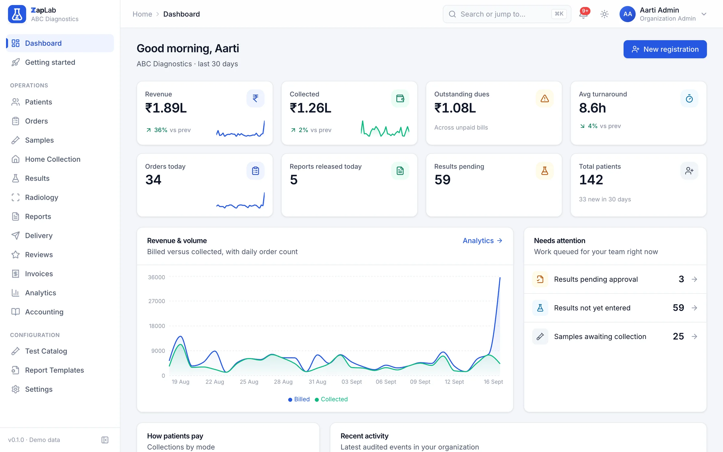
The dashboard puts revenue, collections, outstanding dues and average turnaround at the top, a revenue and volume chart underneath, and a work queue below that: critical results waiting, results not yet entered, samples not yet collected. It is a to-do list as much as a report.
The dashboard combines the revenue and turnaround tiles with the work queue behind them.
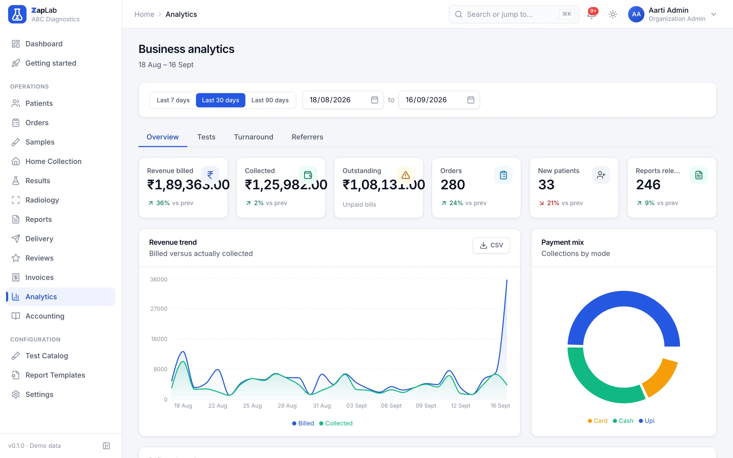
Billed against collected, this period against the last
Pick the last week, month or quarter and every figure comes with the previous period beside it, so a number is a direction rather than a snapshot. Revenue billed, revenue collected, dues, orders, new patients, reports released and the payment mix are all on one page.
The analytics response shape carries the current and previous period for every figure.
Which tests carry the lab
Test volumes and the revenue behind them, ordered so the top of the list is the handful of tests that pay for everything else. It is the view that tells you which reagent to negotiate and which machine is worth servicing.
Turnaround, and how often you miss
Turnaround is measured from registration to report release, over released reports only, with the distribution and the count of orders that went past the service level. Averages hide the outliers, so the breaches are counted separately.
Which referring doctors actually send work
Referrers are records with a commission percentage, and analytics shows orders and revenue by referrer over the period you chose. That turns a conversation about a referral pad into a conversation about a number.
The day book, and what the lab spent
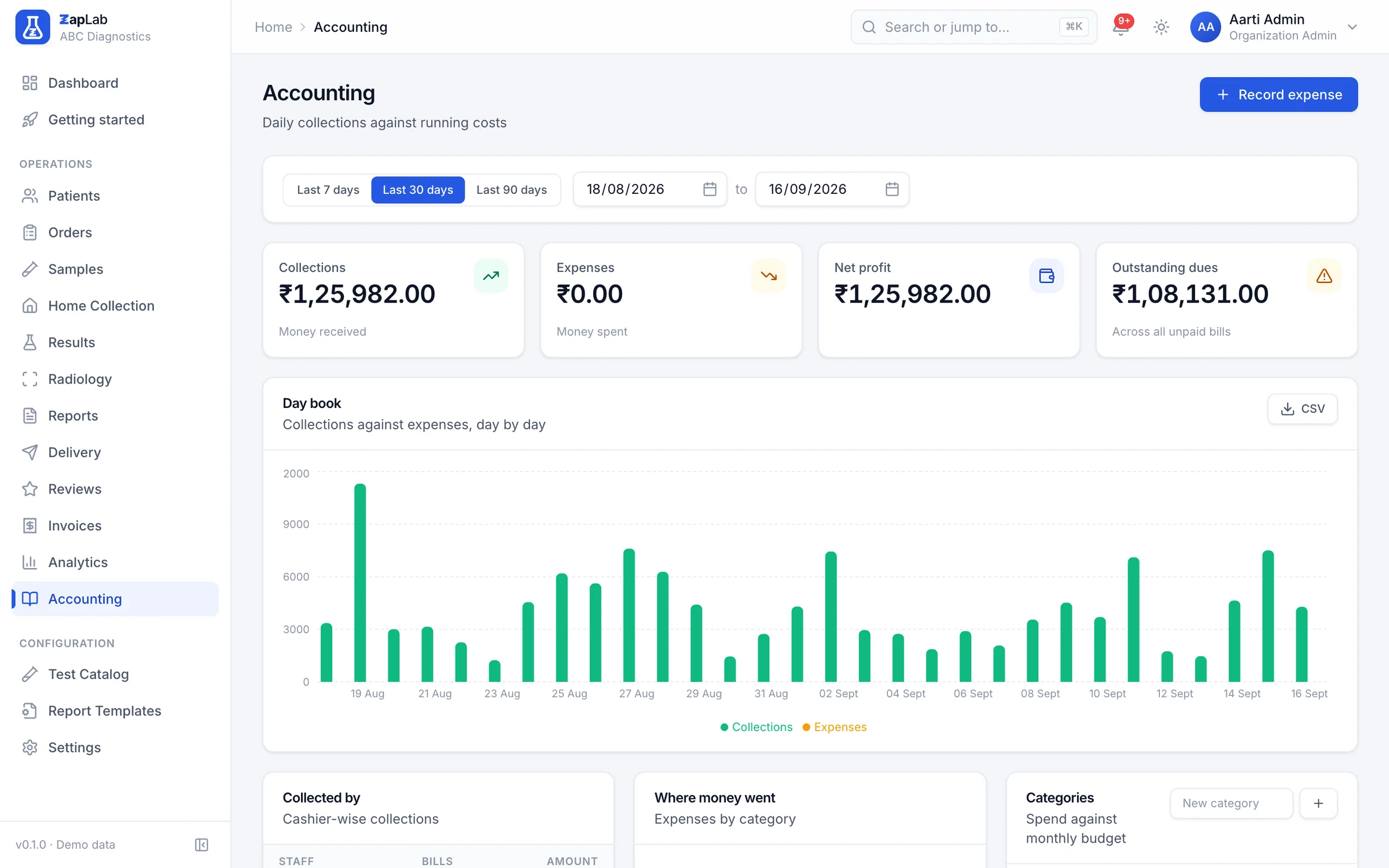
The day book totals collections for a date range beside expenses by category, so month-end is a page you open rather than a spreadsheet you rebuild. Expenses are recorded with a category, a branch, a payment mode and a date.
The day book totals collections and expenses for a date range.
What this does not do yet
Labs ask for all of these. None of them work today, so none of them are counted as features anywhere else on this site.
- No custom report builder. The four analytics views are fixed; anything else is a CSV export you take into a spreadsheet.
- The turnaround service level is fixed at 24 hours. It is not yet configurable per test, per department or per branch.
- No scheduled email of a daily or monthly summary. Someone has to open the page.
- No profit-and-loss statement and no GST return. Expenses are categorised, not book-kept.
- No referrer payout run. Commission percentages are stored and the revenue is visible; paying it is still a manual transfer outside the system.
Where to look next
Two ways to check this page against something concrete: the formats themselves, and the comparison that covers this part of the product.
Related report formats
- Complete Blood Count (CBC) report format
Haematology · Whole Blood (EDTA) · 2 h turnaround
- Lipid Profile report format
Biochemistry · Serum · 4 h turnaround
- Thyroid Function Test (TFT) report format
Endocrinology · Serum · 6 h turnaround
Compare
What other cloud lab software does well, where this system wins, and the rows where it does not.
Set up your lab this afternoon.
Create your organisation, add your tests, print the first barcode. If you would rather see it first, ask for a walkthrough.